National Geographic Table of Contents

22

One thing I have always admired about National Geographic is their design skills on their magazines, especially how clean they always seem to make them. With the 3 examples above the one that strikes me the most is the middle design. Just that one image and how it is cropped really grasps my attention and intrigues me to continue looking at the rest of the content on the page, even if it may not be related to the image.

When developing a table of contents it is important to direct your readers attention to the most eye grabbing content so that they stay interested, and then continue to keep them interested by the content that follows. I always felt National Geographic has done a great job of this.

Expressive Type

Image result for typographical book jacket

This book jacket really beautifully uses type to create the shape of a deer head that I believe is executed wonderfully. Although the book is in a different language, I think the type is still legible but creates the image well. Often I will see people using type as the fill of an image or design, using all the aspects of the type, and it looks beautiful but it is so challenging to read. But this design is done so well that you can see the image as well as easily read the type/title of the book.

Expressive Type

In the image featured above, there is a large chunk of type in a paragraph format. This image displays the type pouring down from the middle as if it was melting- or being poured out into a glass. The letters are bunched up and overlapping to create the illusion of this action. They descend down the page to a small dribble towards the bottom white space- conveying this feeling of motion even more so.

Well Designed Table of Contents

When creating a table of contents, one must design with typography, pictures, and negative space in mind.

I have selected a table of contents from the New York Times Magazine to analyze. I found that this table of contents uses an underlying modular grid to organize the various elements on the page in such a way that creates visual interest.

The title is placed within the top left corner of the grid in large capital letters in an interesting serif typeface. The articles are placed to the right of the title in smaller, bold letters. The page numbers of the articles are colored a vibrant orange which creates a typographic emphasis– they stand out from all the other elements on the page. To hold the readers interest, the designer of this page does not overwhelm the viewer with a large amount of text, but rather a large group of pictures in the bottom half of the page–that seem to show a timeline event described in a photographic progression. As green is featured in these pictures, the green color is also carried into a description about the pictures besides the articles in the top right corner. The orange color featured in the article numbers is also found at the bottom of the page in a small quote which contains a societal confrontation about climate change.

I found this page to be a great balance of typographic elements, hierarchy, pictures, color, and negative space. This balance keeps the reader interested and moving through the magazine.

Typographic Glyphs: Davys Font

I found these glyphs as a part of the Davy’s font, and I was really drawn to the style of them when I saw it in an article. They definitely are described accurately as “quirky”, and they remind me of small tattoos you might find in a tattoo shop’s book of designs, which I find unique and interesting. The leaves on the top right row are very nice and simple, and I just love all of them together as a set with a cohesive look and feel.

Adobe Fonts: 2 Fonts That Work Well Together

Header in Mr. Eaves XL Book, Subheading in Mr. Eaves XL Light, Body text in Didot

I felt that a nice, simple and bold sans serif font would pair really well with a light version as its subheading, and with a serif font for the body text. I believe when pairing two different fonts, it works the best when there is a high contrast between the two in style and weight.

Typewolf

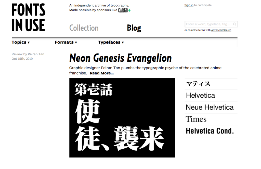
Fonts In Use

After exploring the bounteous sites provided on the Typewolf recourse, I decided to use the Fonts In Use site (https://fontsinuse.com/) for my 9th blog post. Fonts in use is a typography inspiration site that displays and showcases fonts being used around the world today. This website also has a blog page where designers and typographers are able to talk about what fonts they have been using and what they are using them for. I think this website is helpful because it gives you inspiration and an idea of what other artists are using today.

Table of Contents

Blog Post 6

A book that I found that had an interesting use of typography and organizational layout was Snoop Dogg’s cookbook, “From Crook to Cook”.  The table of contents is designed very unconventionally compared to other traditional table of contents. The titles of each chapter use a mix of a very traditional, royal serif font for the first letter and a clean sans serif font for the rest of the phrase. It’s a very odd combination but works well with the overall personality and tone of the book and helps to portray the voice that Snoop Dogg brings to his book. The headings for the chapter names (i.e. Introduction, Chapter 1, etc.) are in a small bold sans serif font that helps draw attention to itself but not enough so it takes away from the actual title. The layout of the list is not in any tradition chart/grid format, however displayed across the spread to fill the page and interact with each other through spacing. The background colors are also muted and light that help draw the attention to the font and not disrupting the reader. 

Table of Contents

I chose to write about the table of contents in my Intro into Communications class not because it looks nice, but its the first book I have noticed that has both a brief description for content and an in depth section; which I have never noticed in a textbook before. In the brief contents section, the information follows a hierarchy of the part title, then the chapter number and name, and lastly the part number as the least important bit of information. Hierarchy is created through changing the size and weight of the font and there isn’t much color difference with the text because only the “part one, part two,..” have their opacity decreased.

For the more in depth part of the contents, none of the words are colored either; only the change in the font weight is used for the text however this doesn’t mean that there is no color used. Instead color is used to call out the chapter number, name and page number to show this information as the most important. Then, each subsection of the chapter is is larger and heavier then the last part of information. All of the page numbers are same size and are the same size as the subsection titles because the author believed that this information was equally important to the readers. The remaining use of color for these pages are used as bullet points for more important bits of information.

Of course this book isn’t one I actively searched for, it’s one that I was assigned to read in class. Therefore, it’s designed to look like a normal learning textbook and I wouldn’t normally pick up this book and read it. I just believe that it makes the readers experience easier what looking for a specific section and that might appeal to the professor assigning the book if they notice this detail.

Table Of Contents

This table of contents I found in a 6th grade Mathematics book stood out to be for its simplicity yet personality. Obviously when creating a textbook for kids. the designer needs to make it simple enough for the reader to not get overwhelmed by the information but also fun and friendly so the become engaged. The colors used are bright which catches the readers eye. The colors used also make it simple for the reader to decipher between the different categories listed. The illustration on the bottom is a fun design element that balances out the right side of the page with the grid.