Typographic Ornaments – Nelson

Screen Shot 2019-12-17 at 2.07.22 PM.png

These are some of the ornaments that come with the typeface Nelson. They are mostly nature icons such as flowers and leaves, but there are also several glyphs that are nice for borders. I found this typeface and the ornaments on Typekit, and I was drawn to these because I like how they look like ink stamps (with the bleeding, rugged edges). I think these would be nice for stationery, especially invitations, greeting cards, and maybe even business cards if you want to add a rustic nature vibe.

Typographic Ornament

Screen Shot 2019-12-15 at 5.46.12 PM

When fonts are being developed there are a variety of gylphs, ornaments, widgets, etc. That need to be added into the font family but there are various type designers who leave them out because they don’t want to be bothered with the design.

My favorite font I have ever been able to use is Avenir Next, and they took it upon themselves to go through and design special characters, greek letters, etc. Because when it comes to a good design you don’t leave out possible clients.

Although people choose not to design them based on if they would work with their type design, sometimes they don’t. Specifically the way their typeface is designed may not be able to produce a special character or ornament; it could be unreadable, so why make it?

It is always interesting how fonts, and typefaces are designed and what is chosen to be designed and what isn’t based on their structure.

Typographic Ornament

Screen Shot 2019-12-15 at 3.44.20 PM

After searching through various Typographic Ornaments I decided on choosing the set Nymphette. Nymphette is described as dingbat set that contains centuries old traditional calligraphic text decorations, ornaments, and scrolls. This set is a very popular and commonly used ornament decoration. I chose this because of the simple yet elegant design of these ornaments. They could easily be incorporated with text to add a subtle yet fancy accent.

Typographic Ornament

Screen Shot 2019-12-10 at 11.16.35 PM

While looking across numerous website for Typographic Ornaments I cam across one name that I full recognized too well, Minion Pro. Minion Pro was in 1990 for Adobe Systems and has always been a favorite of mine. The image above portrays the naturalistic ornaments which match well with the oldstyle design of Minion. The designer consciously gave them the character of hand-drawn illustrations which is what I love most about them. They are clean, modern and usable for various mediums.

Typographic Ornament

If you’re looking for a typographic ornament, Bodoni Oldstyle 72 is the way to go. This typeface is filled glyphs and decorated letters. An example of how to tell if the typeface is Bodoni is to look at the A. As you can see the A has a little ball at the serif’s beginning and the curvature of the tail at the end. That is a signature sign of Bodoni.

Bodoni was invented somewhere between 1740-1813. It has been revised many times and was created with the inspiration from Didot (another typeface fairly similar). Bidoni has many uses, especially in the poster and magazine industry.

Glyphs of Bodoni include:

Ornamental Composition from Bodoni Glyphs by Sung-Jin Kim | Minimo Graph

These glyphs have a old looking style hence the ‘oldstyle 72’. One person even made a decorative piece using the characters.

Typographic Ornaments

Originally, I was going to look more into Bodoni ornaments because Bodoni has become one of my favorite fonts to use. I decided to change to Minion Pro ornaments because in all truthfulness I don’t really like the look of Bodoni ornaments. Another reason I decided to look more into Minion Pro ornaments is because I never realized that Minion Pro had ornaments. I think often time, for me personally I just look over ornaments because I never really use them. I came across a site called thebookdesigner.com and Minion Pro’s ornaments stood out to me because they are small, cute and look like little drawings. They were created in 1990 by Robert Slimbach. These ornaments even though they are small still stand out the perfect amount because of the contrast of black and white in them. I like them because they are simple, clean and aren’t too dramatic.

Typographic Ornament

While looking through different glyphs, one that struck my eye was the only vintage set of typographic glyphs. I like that this set includes not only glyphs but different symbols that go along with the overall style and theme. The glyphs are simple and delicate, subtly adding to the tone that the old-style serif fonts sets initially. This set also uses muted tones and colors that highlight the contrast between thick and thin strokes. The curves of the glyphs also highlight the rigidness of the serif-font that they chose to use to represent a retro theme. The curves also give the glyphs a heightened sense of elegance and emphasize how the glyphs interact with the font to create one cohesive, vintage theme.

Typographic Ornaments

typography secrets fonts with great best glyphs symbols graphics adobe caslon pro
Adobe Caslon Pro’s type ornaments were designed by Carol Twombly and based on William Caslon’s own specimen pages printed between 1734 and 1770 (Friedlander). The mostly floral ornaments have a uniform color and line weight and can make any paper seem elegant. These are some examples of the different shapes. What defines the glyphs is that they are mostly floral, have curved lines and some have a very pretty scalloped shape. I think that many of these glyphs would look great when placed in the corners of formal letters or resumés, to provide stylish, vintage inspiration

https://www.thebookdesigner.com/2012/04/5-favorite-fonts-with-hidden-type-ornaments/ 

Typographic Ornaments: Fleurons

Image result for Fleurons

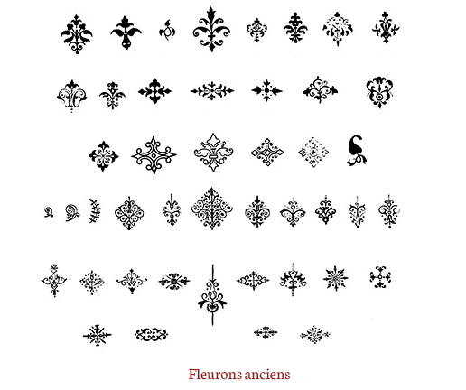
While researching typographic ornaments I came across Fleurons. Fleurons are a typographic element, or glyph, used either as a punctuation mark or as an ornament for typographic compositions. Fleurons are typically stylized flowers, leaves, or decorative swirling symetrical designs. They have a french influence and were used predominantly to seperate paragraphs and to fill the white spaces in paragraphs.