Online Font Libraries – Typekit


Screen Shot 2019-12-17 at 1.36.59 PM.pngThese are the fonts Bely Display Regular and Halyard Display Book. I retrieved them from Adobe Typekit and tested them out in InDesign, using Bely for the heading and Halyard for the body copy. I think these two work well together because one is a heavy slab serif typeface while the other is sans serif and better for reading. I played with different weights for Halyard (ExtraLight, Medium, etc.) until I found one that went well with the Bely heading.

Online Font Libraries

Screen Shot 2019-12-15 at 3.23.32 PM

I found two fonts through Typekit and ended up choosing two very different fonts that mesh well together and give off an elegant almost invitation feel. The two fonts I used are Scriptina and Copperplate. Scriptina has name loops and swooshes that overlap, it is commonly used for few word titles as the loops can be too overwhelming in sentences. Copperplate on the other hand is known as a ‘Gothic’ font with small glyph serifs. I ended up using this font combination for a few of my business cards, it gives off elegant and put together vibes when used together and are a popular wedding invitation combo.

Gelasio & Montserrat

Screen Shot 2019-12-15 at 5.25.00 PM

I went on to Google Fonts and I found these two fonts Gelasio, serif; and Montserrat sans serif. They’re both relatively bold in style, net necessarily physically bold; but they have their own forms. Although they are quite different I believe that they mix well together

I initially tested the serif font to be used as the content and date styles but, serifs should be kept large and in charge so I brought it to the title of the events and I believe it worked out best. The sans serif font is strong and heavy in the sense that it’s much easier to look at in chunks.

These two fonts work well together in chunking information, giving it an appealing look as well as being legible to most readers.

Online Font Libraries

I chose to look at fonts on Typekit which has recently been switched to Adobe Fonts. I wanted to look at these fonts because I have an adobe cloud subscription. I didn’t realize that I could view all the fonts and activate them as well so that’ll definitely be helpful in the future. The fonts I chose that work well together are Amplitude Black and Benton Sans Book. Amplitude Black is the font I used for the header and Benton is the used in the place holder text. The fonts do resemble each other which is why I like them together but the do have differences. Amplitude is a font I would use for a heading because some of the letters like L and H reach above the ascender line. I personally wouldn’t like the look of that if amplitude was used as paragraph text. I also like the look of having a really bold heading and then the paragraph text is a thin font. I was between Benton Sans Book and Thin when choosing the paragraph text; but the Benton sans thin seemed a little to hard to read. While they both look the same Benton sans book is just a little bit bolder.

Online Font Libraries

I used Google fonts to find two fonts that work together and one that I really loved was Playfair Display and Source Sans Pro. Playfair Display has unique curves in its serif that make it look delicate and elegant, especially as a headline font in a large size. Source Sans Pro is a sans serif font that doesn’t distract from the headline and is easy to read, especially on a screen. The slight curves in each letter of Source Sans Pro subtly matches the curves that Playfair Display boldly embodies. I think that these two fonts work wonderfully tougher and work well together in any sort of layout. 

Online Font Libraries

Screen Shot 2019-11-14 at 10.50.02 AM.png
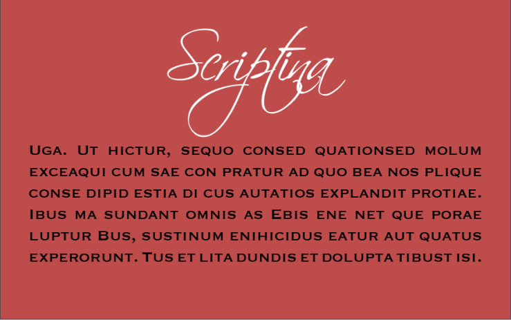
I chose to go with Google Fonts and found the typefaces Bitter and Monsterrat. I enjoy putting a serif and sanserif together to make it seem like it has a sort of format and some level of hierarchy. The Bitter font has only three types: bold, italic, and regular. While Monsterrat has 12 types to vary with. In the beginning of the paragraph you can see which type is used in italics. I decided to use a black background to sort of emphasize the typefaces and their shapes so that they stand out more. And I was able to preview this feature through google fonts since you can change the background of the page to see the font in black or white colors. Therefore, I believe these two paired well together especially with the variations of thick and thinness.

Online Fonts

The if this is too blurry, please open the PDF.

I searched on Google fonts for two fonts that I liked paired together. I used Indesign to match fonts and decided that Raleway and Merriweather go well together. I believe since Merriweather is a thicker serif font that pairs well with the lightweight Raleway. It makes the type seem serious, but relaxed at the same time and would be good to use as type in a project.

Adobe Fonts: 2 Fonts That Work Well Together

Header in Mr. Eaves XL Book, Subheading in Mr. Eaves XL Light, Body text in Didot

I felt that a nice, simple and bold sans serif font would pair really well with a light version as its subheading, and with a serif font for the body text. I believe when pairing two different fonts, it works the best when there is a high contrast between the two in style and weight.

Online Font Libraries

URW Antiqua and Niveau Grotesk

For the 8th blog post, I decided to browse through Typekit instead of Google fonts since I have already become familiar with that online font library. I knew beforehand that I wanted to find a serif font for the heading and a sans serif for the text. After playing around with many different combinations, I decided to use URW Antiqua for the bigger text and Niveau Grotesk for the smaller text. I like the way these two work with each other because its appearance isn’t too aggressive or too subtle.