Expressive Type – King Kong

26-king-kong-alive-poster-3.nocrop.w710.h2147483647.jpg

This is the poster for the King Kong musical that recently closed on Broadway. The type for the title is shaped to look like the ape’s teeth. This shape and calligraphic type are used to put more emphasis on the ape’s gaping mouth, suggesting that the mouth is opening to let out a fearsome roar. The white type against the dark background also establishes the title as a focal point, and the overall dark tones of the poster further convey a serious tone and fearsome energy.

Expressive Type

Image result for typographical book jacket

This book jacket really beautifully uses type to create the shape of a deer head that I believe is executed wonderfully. Although the book is in a different language, I think the type is still legible but creates the image well. Often I will see people using type as the fill of an image or design, using all the aspects of the type, and it looks beautiful but it is so challenging to read. But this design is done so well that you can see the image as well as easily read the type/title of the book.

Expressive Type

In the image featured above, there is a large chunk of type in a paragraph format. This image displays the type pouring down from the middle as if it was melting- or being poured out into a glass. The letters are bunched up and overlapping to create the illusion of this action. They descend down the page to a small dribble towards the bottom white space- conveying this feeling of motion even more so.

Expressive Type

The Paradox of Tolerance by Dalena Train is an expressive type book that explores how censorship is a disservice to society. Train believes type can be manipulated to explore and communicate an idea, and that with a broadened sense of awareness, we can uncover the truth. This book shows this idea through it’s use covering of abstract, high contrasting, black and white text within various sizes and styles throughout. This allows more expression to be given to the words and phrases left uncovered, for example, there is no censorship on 2 pages of large text, “Censorship is the tool of those who need to hide actualities from themselves and others…” The contrast between the sizes also draw attention towards that portion of text, as well, such as the “But am I hurt, yes…” paragraph in the final photo.

Expressive Type by Tina Smith

While searching for examples of expressive type, I found an interview with a designer named Tina Smith. She talks about how she did a challenge where she created a typographic design everyday for 100 days based on a word or phrase.

I admire this style and I think it is really pleasing to the eye. The color palette is nice and simple and I enjoy how each one is creative in its own way, not just taking the words so literally. I like the “all in your head” one specifically because it can show how scattered and chaotic the inside of our minds tend to be.

Expressive Type

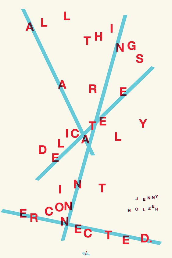
For blog post 7, I chose a poster that conveys an abstract form of expressive type. The quote “All things are delicately interconnected” is spread across the page and the letters are grouped purposefully so the visual matches the message. The letters are held together by blue intersecting lines that run through the whole sentence, disorienting the viewer at first glance. Once you start to figure out what the quote says, we can see how the blue lines guide our eye to help us make sense of the letters. Also, the way that they are non-uniformly grouped also represents that things that are delicately interconnected do not always have to be neat and organized. This piece makes the viewer feel the interconnection within themselves that the artist is trying to portray through expressive type.

Expressive Type

9780698185395-medium

For an example of something that expresses type in motion in a very thoughtful and interesting way, I chose the book cover for The Girl on the Train by Paula Hawkins. The designer used a major subject in the book (a train) in creating the cover to express a feeling of movement and almost a fast rush. The plot in the book also makes for a heart-racing experience. The author did well in creating motion by using this sans serif Avenir font along with a “pull” in the letters, and fading out in the ends of the words.

The background reinforces the motion created by the type, as it moves in a horizontal (slightly diagonal) motion that appears fast because the blurred scene created by the image. The white color of the type contrasts well against the backround because of both the colors and the blurriness of the image. Overall, I think this book cover conveys an image that goes hand-in-hand with the story in the book and creates a simple movement that allows the reader’s eyes to move as if they were looking out from a train.

Expressive Type

light years.jpg

This poster was designed by Michael Bierut for a ball in 1999. It’s a very subtle for of expressive type but still eye grabbing. He was able to create a sense of light by playing around with the color and transparency of the overlapping letters. You can almost sort of feel the energy of the light by given the illusion that it’s light. They’re not a solid color but sort of “dusted” for the effect similar to neon light signs. I believe this poster is captivating just enough for the audience to wonder what it’s purpose is in order to read the super fine print at the bottom.

Expressive Type

good5070_poster

This PSA poster is a fantastic use of expressive type. The statistics given are conveyed not only though words but also through visuals. By cutting the word water off half way and expressing the meaning for it, it really allows for the reader/viewer a higher understanding when experiencing this poster.  Words have different meaning when type design is involved. This design took on the element of water and really allowed for a hard and deep message to be seen and heard.

Expressive Type: Sweeney Todd

I found this Sweeney Todd poster and thought it was a perfect example of expressive type. The poster uses motion through the words, starting at the top with SWEENEY being the largest font and in white against the red and black. The reader has to work their way to the bottom which the wording is in red, not to take away from the focal point of the name. The simplicity of the background says a lot about what Sweeney Todd would be about by using the red to make it look as though blood is splattered against the black. This background works well for the poster causing it to stand out but also not taking away from the wording.