Expressive Type

In the image featured above, there is a large chunk of type in a paragraph format. This image displays the type pouring down from the middle as if it was melting- or being poured out into a glass. The letters are bunched up and overlapping to create the illusion of this action. They descend down the page to a small dribble towards the bottom white space- conveying this feeling of motion even more so.

Well Designed Table of Contents

When creating a table of contents, one must design with typography, pictures, and negative space in mind.

I have selected a table of contents from the New York Times Magazine to analyze. I found that this table of contents uses an underlying modular grid to organize the various elements on the page in such a way that creates visual interest.

The title is placed within the top left corner of the grid in large capital letters in an interesting serif typeface. The articles are placed to the right of the title in smaller, bold letters. The page numbers of the articles are colored a vibrant orange which creates a typographic emphasis– they stand out from all the other elements on the page. To hold the readers interest, the designer of this page does not overwhelm the viewer with a large amount of text, but rather a large group of pictures in the bottom half of the page–that seem to show a timeline event described in a photographic progression. As green is featured in these pictures, the green color is also carried into a description about the pictures besides the articles in the top right corner. The orange color featured in the article numbers is also found at the bottom of the page in a small quote which contains a societal confrontation about climate change.

I found this page to be a great balance of typographic elements, hierarchy, pictures, color, and negative space. This balance keeps the reader interested and moving through the magazine.

Animated Lyrics

A youtuber/artist by the name of Maginpanic has created a very graphic, animated lyric video, also known as kinetic typography,  for the song “Bury a Friend” by Billie Eilish. Eilish brands herself as sensitive, mysterious, and grim. This lyric video is composed of dark, silhouetted images which utilize only four colors. The graphics paired with the minimal color choice tells the song’s story in a stylish, artful way. The handwritten feel to the text provides more of a gritty, human element to the video as well.

Typographical Rhythm

When reading a lineup of a festival, one analyzes many levels of information at once. The poster below is a beautiful example of a ascending and descending hierarchy in the form of textual elements.

vdf18-full_lineup_admat-v28-b6590abe.jpg

This piece displays many levels of important information inserted into the top half of the page like the event date, name, type of festival, and location. The large middle portion of the poster contains the artist lineup.  Overall popularity of the artist will correspond with how large the type is and closeness to the top, although many of the artists on this lineup are very well known. The bottom half shows the link to ticket sales and sponsors.

There are a variety of unifying elements within the piece. The back layer of the poster contains an orange/aqua/blue/purple gradient that is seen throughout the the body portion. The size of text vibrates visually top to bottom- small date contrasts large event title, which contrasts with smaller light blue heading, then date line.  The eye then moves from one artist name to the next from left to right, names descending in size line by line. Artist names are separated by a simple cross symbol which reveals the gradient color from the back layer. The rhythm created from top to bottom is strong and very cohesive. The color scheme chosen for this poster is lively and modern-tribal looking. I found the hierarchy to be quite clear and the typeface suits the job perfectly, giving the poster character and style.

Commercial Type

“A type foundry is a company that designs or distributes typefaces. Before desktop publishing, type foundries manufactured and sold metal and wood typefaces and matrices for line-casting machines like the Linotype and Monotype machines designed to be used with letterpress printers.” – Wikipedia.

As a designer, it is important to support refreshing type design- it can be a great source of inspiration. Type foundries are companies that provide viewers with a digital lookbook of a variety of typefaces.  One of the many type foundries I found attractive is called Commercial Type.

Commercial is a joint project out of New York and London created by Paul Barnes and Christian Schwartz.  The two have collaborated and created various award-winning typeface projects since 2004.  Their website publishes typefaces to be sold which are developed by their staff, outside collaborators, as well as Schwartz and Barnes themselves.

Screen Shot 2019-10-08 at 6.03.55 PM.png

The website features a premium array of professional, charismatic typefaces, all available for purchase. The website also offers other content such as a typeface-related newsfeed, merchandise shop, a detailed note about licenses, and a rainbow-colored, animated page dedicated to showcasing the fonts available on the site.

Screen Shot 2019-10-08 at 6.11.43 PM.png

I found this page to be the most creative- one is able to select a typeface of choice and enter a last name and number to be displayed in the different font families available in the selected font, as well as a random selection of color scheme to help the viewer visualize it being used in a project. Each font selection will lead you to a unique, interactive display of your text.

Screen Shot 2019-10-08 at 7.25.13 PM.pngFor example, “Druk” page gives you your text displayed in all caps, lowercase, or a fill-the-page bold option. “Duplicate Ionic” pictured above will duplicate your text across the page. “Dala Floda” on the other hand provides one with their text displayed at the press of a piano note… each note sounds and displays your choice of word toggling between font families (picture below).  What a fun way to not only view, but play with typeface.

Screen Shot 2019-10-08 at 6.18.06 PM.png

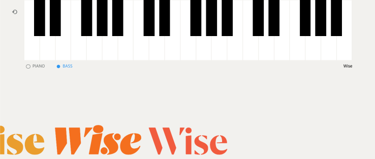
I found this site to be extensive in its quality and showcasing ability. No wonder the typefaces prices are so steep.

Successful Specimen

A successful type specimen spread is well designed, clean, and does not include distracting elements that take attention away from the type itself. After searching on Behance, I found a font specimen book created Florentino Diaz.

serifa font spread.jpeg

The book featured a slab-serif typeface called “Serifa” created by Adrian Frutiger. The spread featured in the picture provided shows Serifa light in all capitals on the left, as well as its special characters and numbers. On the right side of the spread is Serifa roman being used as a large display size, while also highlighting its unique sharp characteristics.

I found this spread effective in highlighting the important details of the typeface while using minimal decorative detail or an extravagant color scheme.  Adrian Frutiger’s work is meant to be very legible and easy to read at far distance.  For Florentino to add decorative details to this book would be an inappropriate approach to display and analyze Frutiger’s typeface.

Identifying Font

For my first blog post, I decide to try and determine the fonts found on a household object- a Eucerin lotion bottle.  By utilizing “WhatTheFont!” from myfonts.com, I was able to locate some of the font names used on this packaging by using an image as reference.  The text that reads “Original” was quite easy to decipher as a version of Optima Nova Light. This font is easily recognizable because of its circular “O” and “G”, as well as the slight contrast in line widths in the capital “N”, “A”, and “R”.
IMG_2265.jpg

“Healing” below the previous line seems to be the same font but in bold. The text that reads “Eucerin” was a more difficult find, however.  What makes this font so unique is its narrow capital “E” along with the “c”s wide open counter, the rectangular dot within the “i”, and stout rectangular terminal of the “r”.   Following these specifications, finding a matching font was not possible. I found that “Tabac Glam G3 Semi Bold” and “Salzburg Serial Bold” were most like the font used in the packaging.

Screen Shot 2019-09-14 at 9.02.52 PM.png
Tabac Glam G3 Semi Bold
Screen Shot 2019-09-14 at 9.03.35 PM.png
Salzburg Serial Bold