Typographic Ornaments: Fleurons

Image result for Fleurons

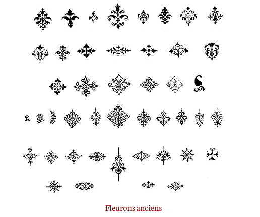
While researching typographic ornaments I came across Fleurons. Fleurons are a typographic element, or glyph, used either as a punctuation mark or as an ornament for typographic compositions. Fleurons are typically stylized flowers, leaves, or decorative swirling symetrical designs. They have a french influence and were used predominantly to seperate paragraphs and to fill the white spaces in paragraphs.

Typewolf: Typogui.de

Typogui.de is a great resource I found through Typewolf. It outlines the do’s and dont’s of typography in a very clear checklist-like manor. It discusses everything from what typography is to how to use different fonts to how to use an apostrophe. Its a valuable resource to anyone going into design.

Expressive Type: Killed

I think this is an awesome example of expressive type. The placement of the “I” that this artist uses is perfect to display the meaning of the type. Not only does the Artist make the “I” red which is a color correlated with violence but also lays it down to insinuate that its “dead” which further enforced the word “killed”

Animated Type: Conan O’Brien Kinetic Typography

I think this example of kinetic type was done very uniquely. This was an animated type project done fo Conan O’Brien’s farewell address when he left The Tonight Show on NBC. The movement in the video is a bit fast sometimes but it flows well with the audio clip. The simplicity yet uniqueness of this video is intriguing and i think the color scheme is perfect. I mean how can you go wrong with orange for Conan?

Hierarchy Rhythm

This poster has a special place in my heart. I went on this show when it originally toured in 2018. I love it for its perfect display of rob zombies pure grotesquely beautiful aesthetic, the viewer knows (if they know anything about Rob Zombie) immediately know who’s being addressed. The poster also does a good job of showing exactly what the show is like, but I will say for hierarchy’s sake its not the best. All of the text is bold and aggressive and makes it hard for the viewer to focus on one bit of information at a time. The artist shows the most important information (being the tour name in this case) by blowing it up to be the biggest and heaviest type on the page, but also makes the date and location the most color contrasting piece of information on the page creating a bit of tension between where the eye should go. I think the artist should be a bit more consistent in whats the most important text on the page.

Type Houses and Foundries: Camelot

Camelot is a modern type foundry based in Leipzig. Its owned by 3 younger well established artists. Camelot produces very clean and eye-catching typefaces that are simple enough to be used in a variety of situations without being overwhelming or boring. I like that they’re a small foundry created by a close knit group of graphic artist that are passionate about print.

Type Specimen Book: Univers

I was drawn to this type specimen book for a few reasons. Firstly, I love the incorporation of texture into the book, I feel like a majority of type specimen books I look at are mainly focused on color to display their meaning where the marble texture adds an amazing eye-catching quality without overpowering the text. The book displays an overall very clean feeling that I find I’m drawn to as a designer.

Identifying Fonts

IMG_2556
Screen Shot 2019-09-10 at 8.22.01 PM.png
Screen Shot 2019-09-10 at 8.16.02 PM

I decided to find the fonts on my Suave lotion bottle. I used WhatTheFont.com and after much deliberation I decided that the closest match to the SUAVE font in the logo is Ciabatta Regular Italic. The easiest similarities to notice are the contrast in the letters and the curvature in the spurs. I believe that the S was most likely edited by a designer for the logo. The only other extremely noticeable difference in the caps of the u, the caps on the original font are completely flat where in Ciabatta Regular they have a slight curve. I also identified the main text used on the rest on the bottle as a version of Sky Sans. The most obvious identifiers were the lack of contrast in the letters and the flat apex’s. The C’s barbs are slightly different, but overall this is the closest match I could find.