Typographic Ornament

Screen Shot 2019-12-15 at 5.46.12 PM

When fonts are being developed there are a variety of gylphs, ornaments, widgets, etc. That need to be added into the font family but there are various type designers who leave them out because they don’t want to be bothered with the design.

My favorite font I have ever been able to use is Avenir Next, and they took it upon themselves to go through and design special characters, greek letters, etc. Because when it comes to a good design you don’t leave out possible clients.

Although people choose not to design them based on if they would work with their type design, sometimes they don’t. Specifically the way their typeface is designed may not be able to produce a special character or ornament; it could be unreadable, so why make it?

It is always interesting how fonts, and typefaces are designed and what is chosen to be designed and what isn’t based on their structure.

Typewolf: A Pocket Guide to Master Every Day’s Typographic Adventures

In this small resource on Typewolf, it goes over the basics of typography and gives you pointers on how to better understand each of the different aspects that are involved.

Screen Shot 2019-12-15 at 5.35.47 PM

Something I really appreciate about this little guide is that it helps you remember the differences in things by comparing them to outside objects. I always confused typeface and font, but these quotes really allowed me to understand the differences.

Screen Shot 2019-12-15 at 5.35.19 PM

When it comes to creating/developing fonts or even working with them to make copy it is important to follow these simple steps and to recognize the differences. If you don’t follow these guidelines it will be easy for your type or even your designs to not look as clean or legible and those are your most important goals when it comes to working with typefaces.
Screen Shot 2019-12-15 at 5.34.52 PM

A huge issue I have when dealing with fonts, and writing copy is remembering the difference of hyphens, en dashes, and em dashes. They are vital to typography and this little guide allowed me to break it down into something more memorable and helpful.

Gelasio & Montserrat

Screen Shot 2019-12-15 at 5.25.00 PM

I went on to Google Fonts and I found these two fonts Gelasio, serif; and Montserrat sans serif. They’re both relatively bold in style, net necessarily physically bold; but they have their own forms. Although they are quite different I believe that they mix well together

I initially tested the serif font to be used as the content and date styles but, serifs should be kept large and in charge so I brought it to the title of the events and I believe it worked out best. The sans serif font is strong and heavy in the sense that it’s much easier to look at in chunks.

These two fonts work well together in chunking information, giving it an appealing look as well as being legible to most readers.

National Geographic Table of Contents

22

One thing I have always admired about National Geographic is their design skills on their magazines, especially how clean they always seem to make them. With the 3 examples above the one that strikes me the most is the middle design. Just that one image and how it is cropped really grasps my attention and intrigues me to continue looking at the rest of the content on the page, even if it may not be related to the image.

When developing a table of contents it is important to direct your readers attention to the most eye grabbing content so that they stay interested, and then continue to keep them interested by the content that follows. I always felt National Geographic has done a great job of this.

Expressive Type

Image result for typographical book jacket

This book jacket really beautifully uses type to create the shape of a deer head that I believe is executed wonderfully. Although the book is in a different language, I think the type is still legible but creates the image well. Often I will see people using type as the fill of an image or design, using all the aspects of the type, and it looks beautiful but it is so challenging to read. But this design is done so well that you can see the image as well as easily read the type/title of the book.

Animated Type

36 Days of Type shares multiple artists animated letters for 36 days. Each artists takes a very different take on each of their given letters. Some work really well and create this abstract yet simplistic design that captures the viewers eyes. I believe that this project was something that can inspire others to look at type as something more than just a letter, or bunch of letters put together. But rather as art, shapes, and building blocks to create.

Sasquatch Music Fest

Sasquatch24X36PosteraiThis Music Festival poster really creates a more creative a, b, c format of type hierarchy. The title of the festival is the first thing that I take attention to, as well as the illustration but my eyes drift down to the date of the festival. Then the list of acts for the festival creates a pattern between the different type sizes, and colors allow your eyes to move through the block of text. The bigger acts are towards the top, in bigger font to draw more attention to them.

After going through the wall of text, my eyes pop back up to the top to see Memorial Day Weekend flying through the sky. It’s a really clever and concise way of providing information.

Gill Sans Type House

Gill Sans was designed by Eric Gill and released by Monotype in 1928-1930. The design of this font type can be traced back to one of Gill’s teachers Edward Johnston.

It was an instant success, with its use of the classical g, and a’s it allowed a modern look with a classical feel. Due to its clean design, and easy readability. It began getting a lot of use in London and North Eastern trail-ways, and eventually being used for the British Railway.

Eventually in 1997 the BBC channel used it within its logo. As well as Midlands TV company Carlton.

Between the rounded edges of the c, e, and f and the classical looks of the a, and g. Gill Sans dodges the Roman feel, and brings on the hybrid modern look.samples

Font Specimen Book: Futura

Screen Shot 2019-10-06 at 6.30.27 PM.pngThis Futura type specimen book really captured my eye. It immediately screams, classy, yet fun, bold yet playful. The design of the right page really helped me imagine my own type specimen book, and how I wanted to show some of my display font.
I believe it is very successful because it allows you to look at the font as shapes as well as a typeface. It shows you the flow it is capable of having. I have a similar style of display type in my own type specimen book, because I think it just works so well at displaying a clear and esthetically pleasing look.

Reddit Font Type

reddit-logo-6

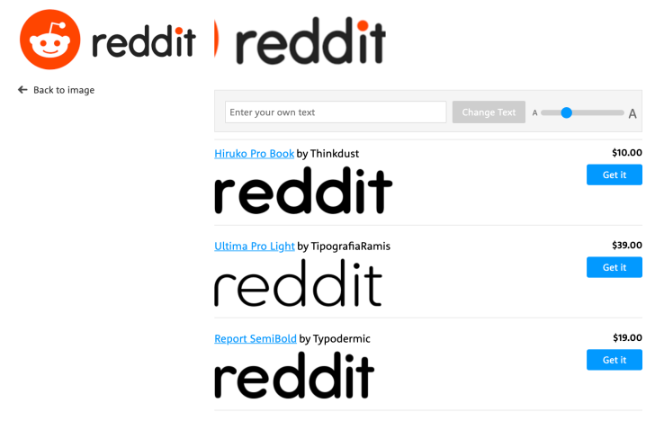
The Reddit typeface has been a very recognizable font type. Although the title of the “i” is drawn and separate from the rest of the font, the rest of the typeface is Hiruko Pro Book. The way you can easy recognize this is the round edges of each letter. The short arms on the “t”, as well as the extensions on the stems of the r, and d’s. Screen Shot 2019-09-11 at 1.14.35 PM

Another couple things to check is the counter of the e’s and d’s. There are many fonts that are similar to the Reddit typeface, but the best match currently is the Hiruko Pro Book, although you can tell the one difference is the overall shape in the d’s.