While exploring glyphs for different typefaces, I stumbled upon an article on thebookdesigner.com that talked about different type ornaments. I find Warnock Pro’s ornaments beautiful because of how they look and it seems like designs you would get for henna tattoos. They were created in 2000 by Robert Slimbach. They are a mix of organic and geometric shapes and I think it relates to nature and spiritual symbols. If I found these in a novel, I would expect it to be a fantasy that takes place in a forest or in a book that discusses people’s beliefs of the spiritual world. I hope to one day use these in a piece of work I produce. Link to article: https://www.thebookdesigner.com/2012/04/5-favorite-fonts-with-hidden-type-ornaments/
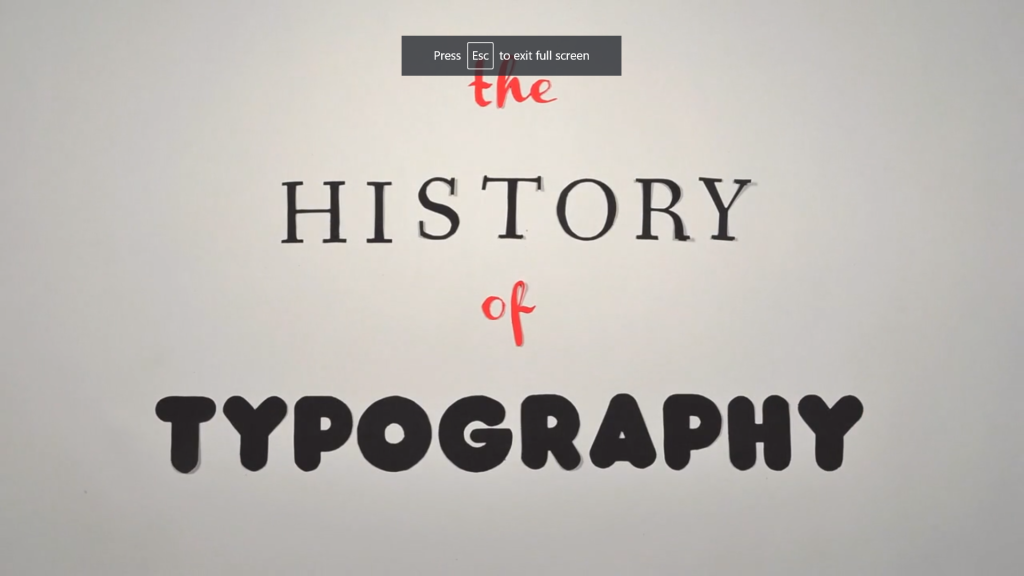
I absolutely loved this video about the history of typefaces. It’s a nice way to learn about these facts through his little animation and it makes it more interesting to learn about it; maybe a little too distracting at times. Knowing a little more about typefaces and how they were created help to distinguish them more when you are trying to identify a font. Especially the part where it talks about Old Style, Transitional, and Modern typefaces, you learn a lot about what sets them apart from other serif type fonts. If you watch this video, let me know what you think about it and how much you were able to learn.
I searched on Google fonts for two fonts that I liked paired together. I used Indesign to match fonts and decided that Raleway and Merriweather go well together. I believe since Merriweather is a thicker serif font that pairs well with the lightweight Raleway. It makes the type seem serious, but relaxed at the same time and would be good to use as type in a project.
Seeing as Halloween is just around the corner, I thought this piece was the perfect one to talk about for our blog. This simple animation can show a lot about Halloween to someone who doesn’t quite know what Halloween is or can’t understand English. The animation helps show that the artist created a “w” with a bat, which is one of the many creatures that represent Halloween. Additionally, the artist choose to use a black background and white words to show the dark theme of Halloween; however I believe that if they used a different colored type, such as orange, it would have better represented what Halloween is. Through the use of motions and animation, this artist created a successful piece of work that works together well to show the meaning of Halloween.
I chose to write about the table of contents in my Intro into Communications class not because it looks nice, but its the first book I have noticed that has both a brief description for content and an in depth section; which I have never noticed in a textbook before. In the brief contents section, the information follows a hierarchy of the part title, then the chapter number and name, and lastly the part number as the least important bit of information. Hierarchy is created through changing the size and weight of the font and there isn’t much color difference with the text because only the “part one, part two,..” have their opacity decreased.
For the more in depth part of the contents, none of the words are colored either; only the change in the font weight is used for the text however this doesn’t mean that there is no color used. Instead color is used to call out the chapter number, name and page number to show this information as the most important. Then, each subsection of the chapter is is larger and heavier then the last part of information. All of the page numbers are same size and are the same size as the subsection titles because the author believed that this information was equally important to the readers. The remaining use of color for these pages are used as bullet points for more important bits of information.
Of course this book isn’t one I actively searched for, it’s one that I was assigned to read in class. Therefore, it’s designed to look like a normal learning textbook and I wouldn’t normally pick up this book and read it. I just believe that it makes the readers experience easier what looking for a specific section and that might appeal to the professor assigning the book if they notice this detail.
While searching for examples of kinetic type, I came across CreativeBlog that has tons of examples. Personally, I love this show (Rick and Morty) and once I saw the video I had to write about it. Knowing where this scene comes from might make the dialog more clear, but I believe this video accurately describes the mood of both the characters and the scene. This video uses the type to show you what is happening through the use of graphics, color, shapes, and unique font. For example, while Rick is talking about his experience in precision, the font is changed to reveal how advanced his skills are compared to Morty by making it look scientific and as if it’s on another level of expertise and arrogance. Then, as the level ground is being built the video accurately shows this by the moving shapes and technical animations Additionally, when the characters become angry or distressed it changes the color of the font and background to a white and red to further relate this to their emotions. Lastly, a successful part of this video is how the creator used different sized and weighted fonts to emphasize the importance of words and/or actions. I feel that the artist couldn’t have done a better job of showing the emotions within this scene.
While searching for a music festival schedule I came across a sheet that listed offers for advertising sponsors at the Red Wing Roots Music Festival. The rhythm in this ad is created with the package name in a bold font, the social media section is bold and italicized, and the content listed in roman font. What could be improved is increasing the font size the package name or changing the color of the font for the social media part to make it seem more unified because it might look like the social media package is an add on rather than it being included in the purchase. Overall, I feel like this sheet provides a clear list of what is included in each package so you know what is the best option for your company when purchasing deals.
While searching for type foundries, I discovered a website called Swiss Typefaces. Their websites bright colors and simple designs caught my attention and I think the page where they list the typefaces offered is especially well designed (see pictures above). On that page, they break up the fonts in categories by placing them within the same block of color and have a picture next to it that matches the color of the block (link to page: https://www.swisstypefaces.com/fonts/ ). They describe themselves as a company created in 2006 that offers typefaces in Vevey, Switzerland and are well known for their aesthetic and design skills. Additionally, Swiss Typefaces pride themselves on being one of the first font foundries that offers a free trail with all glyphs included. They even offer discounts for students for certain products. Lastly, their designers will personally work with clients to create fonts that fit the company’s personality. Check out their website at https://www.swisstypefaces.com/ and see what they have to offer.
While exploring the link to emigre.com from blackboard, I came across Lo-Res which is a bitmap typeface that personally brings back feelings of nostalgia. Similar to what the author mentioned, it reminds me of the classic Pokémon games my siblings and I would play on our Nintendo Game Boys. Bitmap typefaces were rejected by many readers before our generation but have begun to make a comeback as more of our generation are entering the design workforce. The layout of this specimen book mimics an old computer screen full of boxes, which is what really caught my eye and what appeals to others of this generation who grew up reading the bitmap font used in the videogames from our childhood. The type specimen book isn’t too interesting, but I enjoyed the look of the font and how they showed its personality.
I searched for the font that Walmart uses for their Great Value brand’s products. I used whatthefont.com and identifont.com to find out what was used for Great Value’s premium plastic silverware. I found out that the font for the word “premium” was Cicero Bold on WTF. Then, I search for the logo’s font, but had difficulty finding out what font family it belonged to and the closest I came was New Rail Alphabet identified by identifont. However, this is not the exact font because the “a” in the logo is a monocular, not binocular like the New Rail Alphabet; there could have been modification made similar to how Walmart uses Myriad Pro-Bold for the logo, but modifies the W, a, and t. For most of the remaining font it is Myriad Pro and varies between weights.