Typographic Ornament

While looking through different glyphs, one that struck my eye was the only vintage set of typographic glyphs. I like that this set includes not only glyphs but different symbols that go along with the overall style and theme. The glyphs are simple and delicate, subtly adding to the tone that the old-style serif fonts sets initially. This set also uses muted tones and colors that highlight the contrast between thick and thin strokes. The curves of the glyphs also highlight the rigidness of the serif-font that they chose to use to represent a retro theme. The curves also give the glyphs a heightened sense of elegance and emphasize how the glyphs interact with the font to create one cohesive, vintage theme.

Typewolf

Fonts.com is a site that explains the basic fundamentals of type anatomy. It offers a little abstract of what each part of the anatomy is as well as an in-depth explanation if you so choose. With specific anatomical terms, they have how different weights and proportions affect each font and how you can use them in different settings. This website clearly lays out the distinguishing facts between anatomical parts and other factors that makes fonts so unique and special. Fonts.com is a great resource for anyone who is looking for a beginners explanation of typography and the intricate details that it has. 

Online Font Libraries

I used Google fonts to find two fonts that work together and one that I really loved was Playfair Display and Source Sans Pro. Playfair Display has unique curves in its serif that make it look delicate and elegant, especially as a headline font in a large size. Source Sans Pro is a sans serif font that doesn’t distract from the headline and is easy to read, especially on a screen. The slight curves in each letter of Source Sans Pro subtly matches the curves that Playfair Display boldly embodies. I think that these two fonts work wonderfully tougher and work well together in any sort of layout. 

Expressive Type

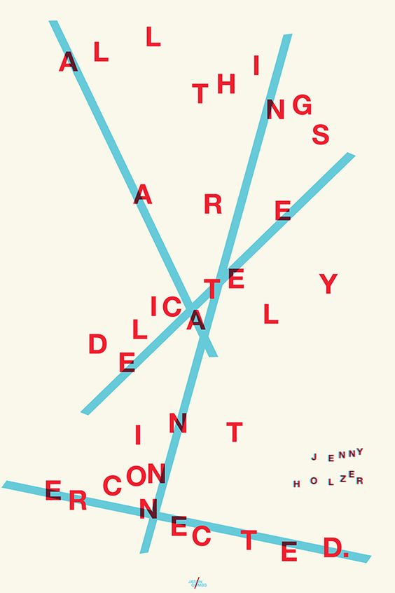
For blog post 7, I chose a poster that conveys an abstract form of expressive type. The quote “All things are delicately interconnected” is spread across the page and the letters are grouped purposefully so the visual matches the message. The letters are held together by blue intersecting lines that run through the whole sentence, disorienting the viewer at first glance. Once you start to figure out what the quote says, we can see how the blue lines guide our eye to help us make sense of the letters. Also, the way that they are non-uniformly grouped also represents that things that are delicately interconnected do not always have to be neat and organized. This piece makes the viewer feel the interconnection within themselves that the artist is trying to portray through expressive type.

Table of Contents

Blog Post 6

A book that I found that had an interesting use of typography and organizational layout was Snoop Dogg’s cookbook, “From Crook to Cook”.  The table of contents is designed very unconventionally compared to other traditional table of contents. The titles of each chapter use a mix of a very traditional, royal serif font for the first letter and a clean sans serif font for the rest of the phrase. It’s a very odd combination but works well with the overall personality and tone of the book and helps to portray the voice that Snoop Dogg brings to his book. The headings for the chapter names (i.e. Introduction, Chapter 1, etc.) are in a small bold sans serif font that helps draw attention to itself but not enough so it takes away from the actual title. The layout of the list is not in any tradition chart/grid format, however displayed across the spread to fill the page and interact with each other through spacing. The background colors are also muted and light that help draw the attention to the font and not disrupting the reader. 

Animated/Kinetic Type

I discovered this Kinetic Type video that animates a scene of the famous TV show “The Office” through different font selection and vector illustrations. The conversation takes place between Jim and Dwight, Jim is represented by the typewriter-like serif font and Dwight is represented by a bold sans serif font that is similar to Gill Sans. The typewriter font that is used to represent Jim goes along perfectly with the whole theme of the shower because they run a paper mill and the logo font of The Office is similar to the one that they use here. The personalities that the fonts portray display both Jim and Dwight perfectly as well as the essence of the show in itself. With the illustrations, the tone of the video help portray the attitude and tone of the show and a major part of that is through the font choice. 

Rhythm of Hierarchy

This is a poster for the Monterey International Pop Festival which happened in June 2017. It uses a palette of warm colors for an inviting feel and focuses the poster on the illustration in the middle with all of the artists playing underneath. The poster uses mostly sans-serif fonts (the numbers are serif) in order for a clean look and easy readability for the viewer. The name of the festival is placed at the top with the largest font size; however, it still can get lost because it uses the same colors as the bold illustration below it. The “Celebrates 50 years” text set within the illustration helps separate the title from the rest of the text and content.

            The designer uses dark blue for the artist list which helps accent the details within the illustration above and ties the whole poster together. The pink glyphs in-between each artist also help separate artist and tie it in to the illustration yet again. The small color palette works really well for this design and helps establish a sense of unity throughout the poster. I would’ve liked to have seen more of the light blue pop out because it was used in the illustration and not in the rest of the poster. Overall, I think this is a great design that showcases unity and is clear to read and has a clear demonstration of hierarchy from the top of the page to the bottom. 

Type House or Foundry

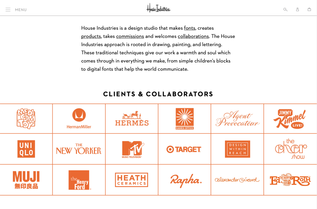
For my Type House, I chose House Industries. House Industries is a design studio based in Delaware that was created in the 1990’s and has had several major type projects over the years. Some of their biggest clients include The New Yorker, Target, and Jimmy Kimmel Live. They even have a testimony from jimmy Kimmel talking about much he loved his redesigned logo from House Industries. Although they have done major projects, they are still a small design studio that makes fonts as well as products from those fonts. All the fonts they create are very clean and unique to the product that they are trying to market. For example, they designed both the fonts that MTV uses and The New Yorker, however both have very similar looks and feels. They are a company that is able to adapt to each customer and create a font that fits their personality and style. 

Type Specimen Book

While I was looking through Pinterest for different type specimen layout designs, I found a series of spreads on the font Didot. (https://www.pinterest.com/pin/472737292107668760/?nic=1)

The book uses a minimalistic color palette which helps highlight the serifs and regality of the font. The minimalist design helps focus on the curves and intricacies of the font and displays how they all work together to fill each page. The placement of the phrases and letters creates shapes on the page which makes it even more interesting for the reader. This gives the book some personality and helps the reader understand the style of the font and how it should be used. The use of light and dark pages on each spread helps them complement each other and helps the viewer’s eye move around the page. The designer also used some delicate shadows on the last spread to subliminally show other symbols while also keeping the minimalist design. The book does a very nice job of keeping a consistent tone while highlighting the delicate aspects of Didot. 

Identifying Fonts

For my first blog post, I decided to analyze my seltzer bottle and identify the fonts that live on the label. Although there wasn’t a direct match, using whatthefont.com the closest font I could find that matched the Polar logo was Hercilio Bold. It is a condensed serif font, and matches the Polar logo because of it’s delicate serifs. The only thing that it’s missing is the slight curve in the “R” & “L”. The rest of the label is a mixture of serif and sans serif fonts, to keep the classy old image of the brand but still have the flavors be easily readable and differentiated they are kept in a sans-serif font. The other serif font that identified in the “100 % Natural Seltzer” part of the label was identified as Kis Antiqua Now TB Pro because of the slants in the serif of the “T” and the curve of the leg on the “R”. Finally using whatthefont.com, I identified the sans serif font as Corpus Gothic Small Caps. The alignment of the “C” is the same and makes an oval instead of a perfect circle, and like the serif font the leg of the “R” kept it’s wavy motion to draw similarities between the two and pull the whole label together.