For the 10th blog post I searched the web to find different typographic glyphs/ornaments. These floral glyphs are part of the Floralia set and I decided to use them for this blog post because I liked the vintage style of the set and the detail some of these glyphs have. I feel that these would be best used for wedding stationary because of its elegant style.
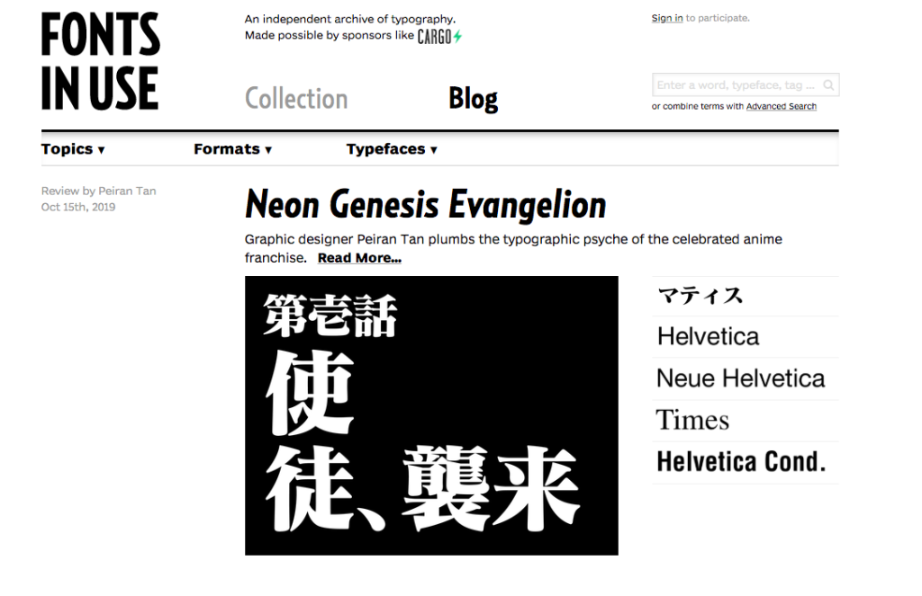
After exploring the bounteous sites provided on the Typewolf recourse, I decided to use the Fonts In Use site (https://fontsinuse.com/) for my 9th blog post. Fonts in use is a typography inspiration site that displays and showcases fonts being used around the world today. This website also has a blog page where designers and typographers are able to talk about what fonts they have been using and what they are using them for. I think this website is helpful because it gives you inspiration and an idea of what other artists are using today.
For the 8th blog post, I decided to browse through Typekit instead of Google fonts since I have already become familiar with that online font library. I knew beforehand that I wanted to find a serif font for the heading and a sans serif for the text. After playing around with many different combinations, I decided to use URW Antiqua for the bigger text and Niveau Grotesk for the smaller text. I like the way these two work with each other because its appearance isn’t too aggressive or too subtle.
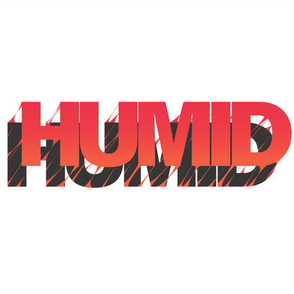
For my seventh blog post, I decided to use these two examples of expressive type. Expressive type is used by many as a creative tool to communicate the actual meaning of a word through design. The design class I took my freshman year of college taught me a lot about this specific subject and has grown to be one of my favorite things to look for in design. The picture of the word “humid” communicates the actual feeling of the word by lifting off the page while being gross and sticky. Even the use of warm color helps to express this word. In the second picture, the designer made two tunnels out of the “n” in the word tunnel.
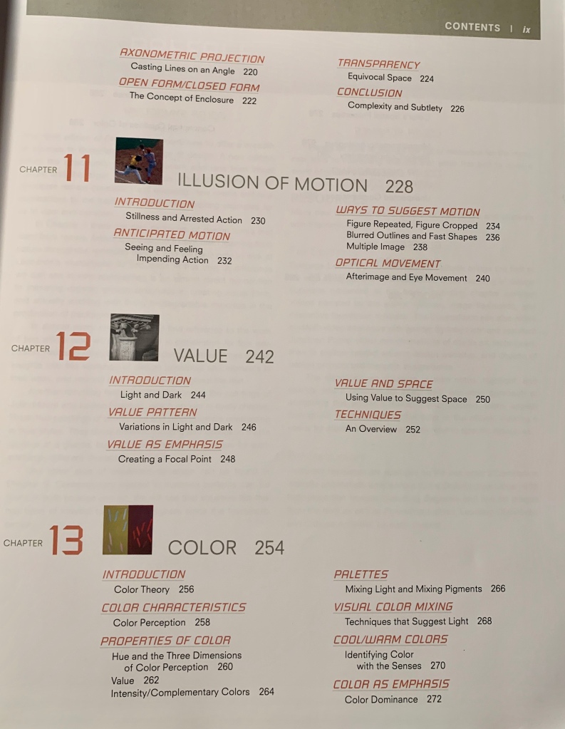
For my 6th blog post, I chose this table of contents from a book called Design Basics by Stephen Pentak and David A. Lauer. You can immediately tell by looking at this table of contents that the designer used a modular grid system to organize the elements on the page. The color of text is used to emphasize the subjects in each chapter and the size of text is used to order the the importance of what you are looking for. The hierarchy starts with the chapter number, which is the largest text on the page and then goes down in size to the chapter title, topics in chapter, and then key info in that specific section. I also thought it was interesting that the designer used the same size for all of the images and placed them on the same baseline as the chapters. This contents page stood out to me most because of how clean and simple it is without being too empty.
While exploring videos of kinetic type on the Vimeo site, I happily came across lyric video to the song “Gooey” by Glass animals. Not many people know this band, but they are one of my absolute favorites and I even got to see them live. Because of my obsession, I knew I had to choose this animation for our 5th blog post. For people who don’t know glass animals and their style of music, it may be hard to understand how the artist communicated the ideas and concepts of Gooey into this video. As a brief background, the song is supposed to be set in a dream-like jungle while the narrator guides the listeners through it, teaching them the inner workings of the environment and the animals that inhibit it. This video incorporates concepts derived from the song by including things like jungle leaves, water ripples, and the creepy eyes of the creatures. It also creates a sense of being in a daze, just like the song does for most listeners.
These are lineup posters from the 2018 Governors Ball that I went to. One lists all the artists and bands together and the other lists them by the date they perform. Naturally, the name of the Festival is the first thing listed on the flyer while using a red drop shadow that makes it pop. It is also the largest text on the flyer indicating that the title is whats most important to this organization. Next, going from top to bottom, the designer listed the the dates of the festival in a condensed font bounded by lines. On the flyer that lists the artists by date, the designer decided to highlight the dates in yellow. Lastly, the designer put all the artist names in the same font and same color but based the size on the popularity of the performer.
While exploring type foundries, Grilli Type stood out to me. Grilli Type is an independent Swiss type foundry that started in late 2009 by Noël Leu and Thierry Blancpain. Their specialty is creating contemporary typefaces that stand the test of time. They offer both retail and custom typefaces and aim to make useful and high quality faces. Some of the many typefaces they offer include GT Zirkon, GT Super text, GT Walsheim Condensed, and GT America Condensed. The shoe store company ALDO uses Grilli Type’s GT Sectra typeface in their logo.
I decided to use the typeface “Cholla” for my second blog post. The bright orange on the title page of the specimen book is what drew me in. This typeface was designed in 1998 by Sibylle Hagmann and is inspired by a cactus she had one encountered in the Mojave Desert. After learning this, I was able to connect the design of the type to the design and structure of a cactus. I also liked how the designers sampled the different styles using words that describe that specific cactus and the desert its found in.
For my first blog post, I decided to identify the font used on my Lumineers album cover for Cleopatra. I chose the album because its one of my favorites and I thought the typeface was interesting because of its wide proportions. At first glance, you can immediately see that the typeface has serifs and that it uses all capital letters with lowered x-heights. After placing my image into WhatTheFont.com, I confidently identified this typeface to be Mrs. Eaves All Small Caps. Mrs. Eaves was designed by a woman named Zuzana Licko in 1996 so its only been around for 23 years while this album was recently made in 2016. It is an adaptation of the Baskerville font that dates back to the 1750s and is mostly used in display contexts.