Specimen Book

Screen Shot 2019-12-15 at 3.50.44 PM

The specimen book project was definitely one of the most interesting projects I’ve ever done. Before taking this class I had never heard of a Specimen book before and was ultimately nervous to take on such an abstract project. Turning out to be such a fun and artist way to celebrate type, this specimen book really caught my eye. This book is demonstrating Baskerville font. I love the color contrasts between the grey and yellow, the enlarged and exaggerated letters are very captivating and are fun to read.

Typographic Ornament

Screen Shot 2019-12-15 at 3.44.20 PM

After searching through various Typographic Ornaments I decided on choosing the set Nymphette. Nymphette is described as dingbat set that contains centuries old traditional calligraphic text decorations, ornaments, and scrolls. This set is a very popular and commonly used ornament decoration. I chose this because of the simple yet elegant design of these ornaments. They could easily be incorporated with text to add a subtle yet fancy accent.

Typewolf

Screen Shot 2019-12-15 at 3.33.37 PM Typewolf has a massive amount of typographic resources, but one I found extremely useful and helpful is Fontology. Fontology or Fonts.com is described as: A complete curriculum on the typographic arts structured as a workbook. This website has an A-Z glossary on everything there is to know about typography for ultimate understanding and decoding of all there is to know to design the perfect typographic piece. I think this is an amazing resource for anyone starting out in learning all there is to know about typography. It’s extremely easy to navigate and has all the basic knowledge and answers when it comes to layouts as well as all terms and definitions on font anatomy. Screen Shot 2019-12-15 at 3.34.09 PM

Online Font Libraries

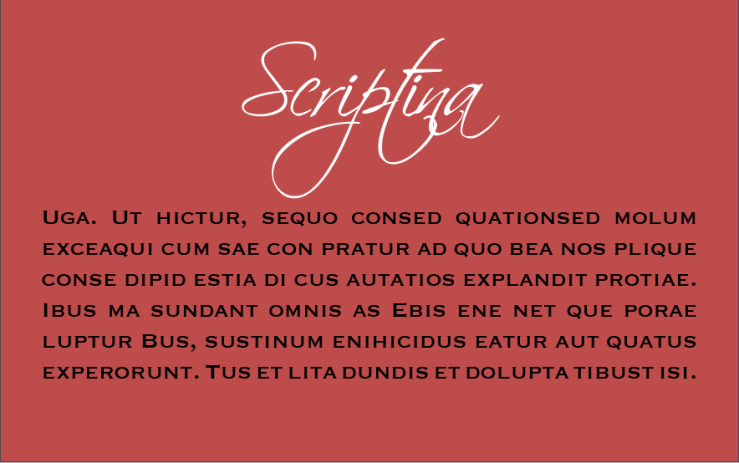
Screen Shot 2019-12-15 at 3.23.32 PM

I found two fonts through Typekit and ended up choosing two very different fonts that mesh well together and give off an elegant almost invitation feel. The two fonts I used are Scriptina and Copperplate. Scriptina has name loops and swooshes that overlap, it is commonly used for few word titles as the loops can be too overwhelming in sentences. Copperplate on the other hand is known as a ‘Gothic’ font with small glyph serifs. I ended up using this font combination for a few of my business cards, it gives off elegant and put together vibes when used together and are a popular wedding invitation combo.

Expressive Type

good5070_poster

This PSA poster is a fantastic use of expressive type. The statistics given are conveyed not only though words but also through visuals. By cutting the word water off half way and expressing the meaning for it, it really allows for the reader/viewer a higher understanding when experiencing this poster.  Words have different meaning when type design is involved. This design took on the element of water and really allowed for a hard and deep message to be seen and heard.

Table of Contents

45

When I started looking for table of contents designs this was definitely not the example I thought I would be most drawn to. At first, I was looking for a design that was colorful and had images, something that would really catch my eye; so by deciding on this one was surprising to myself. The reason I think this table of contents is done so well is the realization that sometimes it can be quite annoying trying to find what you’re looking for in a table of contents page. This design has massive stand out font for both topic and location. Anyone at any age can quickly and efficiently locate what their looking for with ease. Even though the layout uses no color and no imagery, it serves the exact purpose a table of contents page should.

Type in Motion

Screen Shot 2019-11-04 at 11.06.55 AMLumen Type

I found this kinetic type video and was really blown away with how creative the idea was expressed. Although not a traditional form of ‘type’ the name, visuals and music really came together and made something extremely artistic. The type name is Lumen and the letters formed from illuminating light which I thought was super unique and actually quite aesthetic. I loved how multiple sense came together to create a really great video expressing letters. Kinetic type is not something I was too aware about, and it’s cool to see such a different way of making and showing art through type.

Hierarchy Rhythm

Beale-Street-Music-Festival-Schedule-2019

This music festival schedule for the 2019 Beale Street Music Festival is a piece that I think demonstrates a very clear hierarchy rhythm. At first glance, this schedule is very easy to read and break down information. The hierarchy highlights the dates in massive font as well as a bright orange background which further more emphasizes the importance of the dates, which most of the time is the most important information regarding shows. The next part of the hierarchy is the emphasis on which stage each performer will be at. Not as striking as the dates, but nonetheless very much important and is demonstrated perfectly. Lastly, the performers and times of the shows are still very much emphasized due to them still being important, however you can see that through the hierarchy they are not the biggest level of concern. All in all all of the information really stands out on this poster, but just as the designer intended, your eyes travel from one line of information in a very obvious a,b,c rhythm.

Milieu Grotesque

Screen Shot 2019-09-30 at 11.55.48 AM.pngScreen Shot 2019-09-30 at 11.45.30 AM

After researching type houses and foundries, I came across Milieu Grotesque. Milieu Grotesque is an independent type foundry and distributor of digital typefaces that was established in 2010 in Santo Isidoro, Portugal. This foundry focuses on offering typefaces that offer high design flexibility and are routinely updated. Milieu Grotesque was originally founded by Timo Gaessner and Alexander Colby who are graphic and type designers. This foundry really stood out to be through it’s versatile and fun designs that are featured on the website.


Identifying Fonts

L-2859-1300874498.jpeg

Hollywood Records, which is an American record label associated with Disney Music Group uses Rockwell font as their main logo. Although a super simple and straightforward design, the boldness of Rockwell definitely adds more attention to the basic design. This font is clearly identifiable as Rockwell due to it’s strong squared serifs, minimal contrast, short ascenders and very clear vertical stresses. Rockwell is known to be a very mechanical font and is often described as ‘simple geometry’. However, even with it’s bold feel, it still comes off as a friendly and useable font.