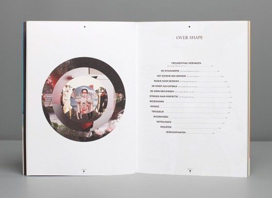
I personally love this design for a table of contents, because it is easy to read while also having a beautiful and interesting look to it. I’m a sucker for minimalism, so the white space and the simplicity of mimicking the circle on the left onto the text is really unique and aesthetically pleasing to me.
